Overview
As part of a college course on edible insects in Design 116: Visual Communication - Graphic Design Studio, I was assigned the task of creating an entire brand around a specific insect. My focus was the mopane worm, a highly nutritious protein source from South Africa. The challenge was to develop branding, packaging, and graphic design to make the product both appealing and accessible to consumers.
With growing concerns about climate change and the demand for sustainable food sources, edible insects are gaining attention as a low-impact alternative to traditional protein. Despite their nutritional benefits, they face a significant hurdle: consumer acceptance. I chose to address this challenge by creating Mopani, a chocolate protein snack designed specifically for children. By incorporating the mopane worm into a fun and delicious treat, Mopani aims to provide a healthier alternative to processed snacks while supporting children’s growth and development in a sustainable way.
Iterations
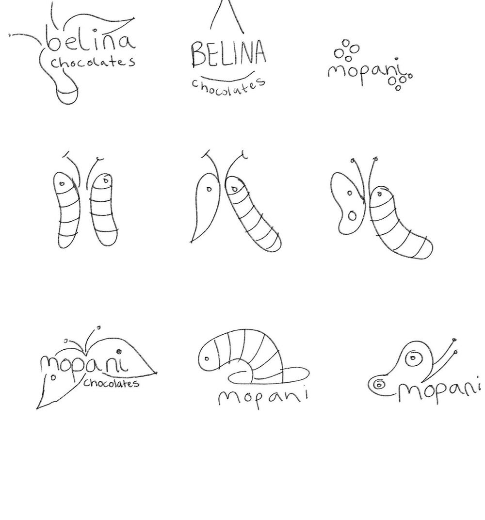
Initial Logo Iterations
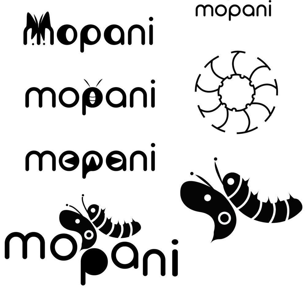
Final Logo
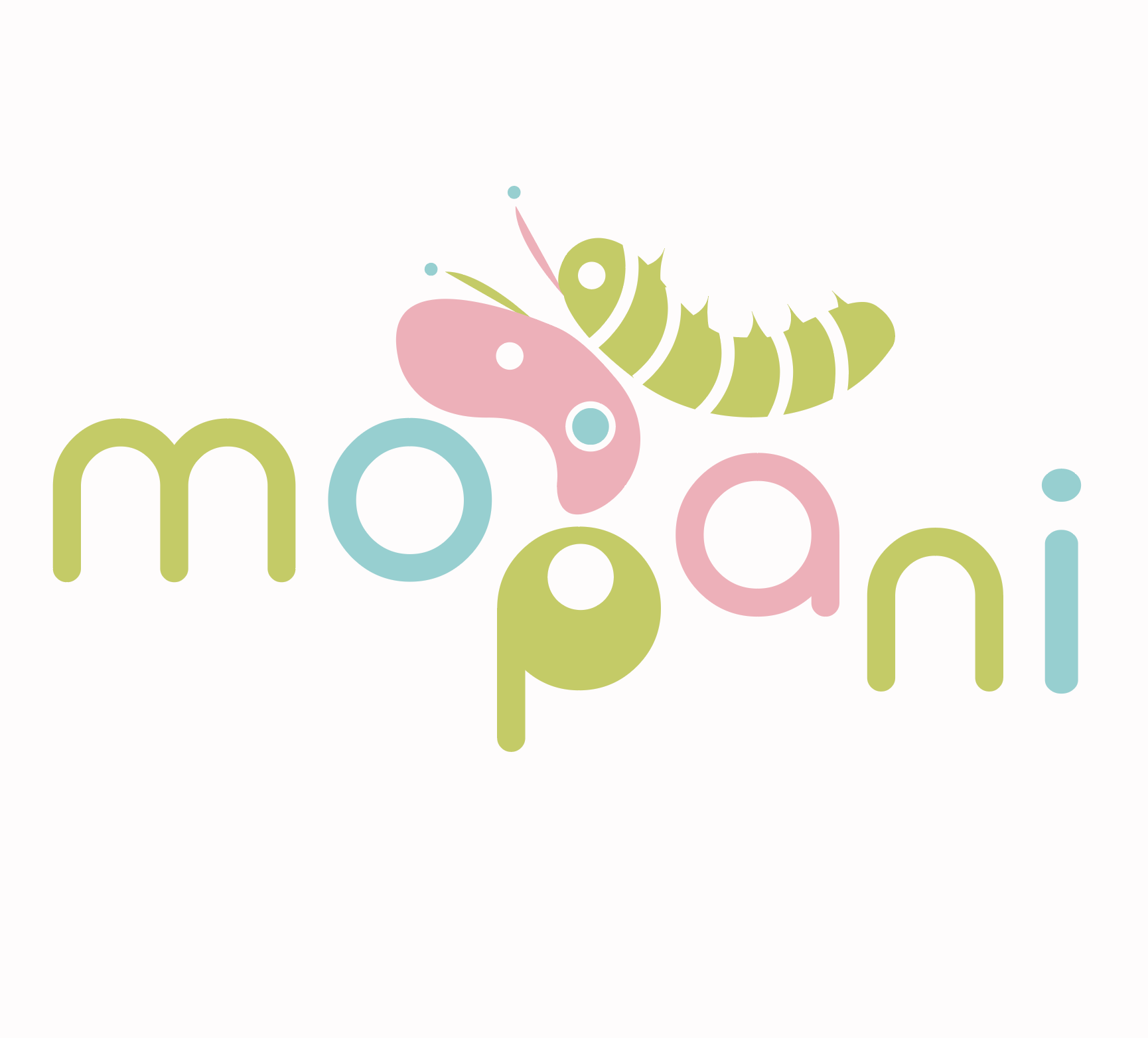
The final logo for Mopani captures the themes of metamorphosis and growth by featuring both a butterfly and a caterpillar. This symbolizes the transformative journey of the mopane worm while drawing a parallel to the growth and development of children as they enjoy the product. By including both the worm and its moth counterpart, the design adds an educational layer, emphasizing the fascinating life cycle of the mopane worm.
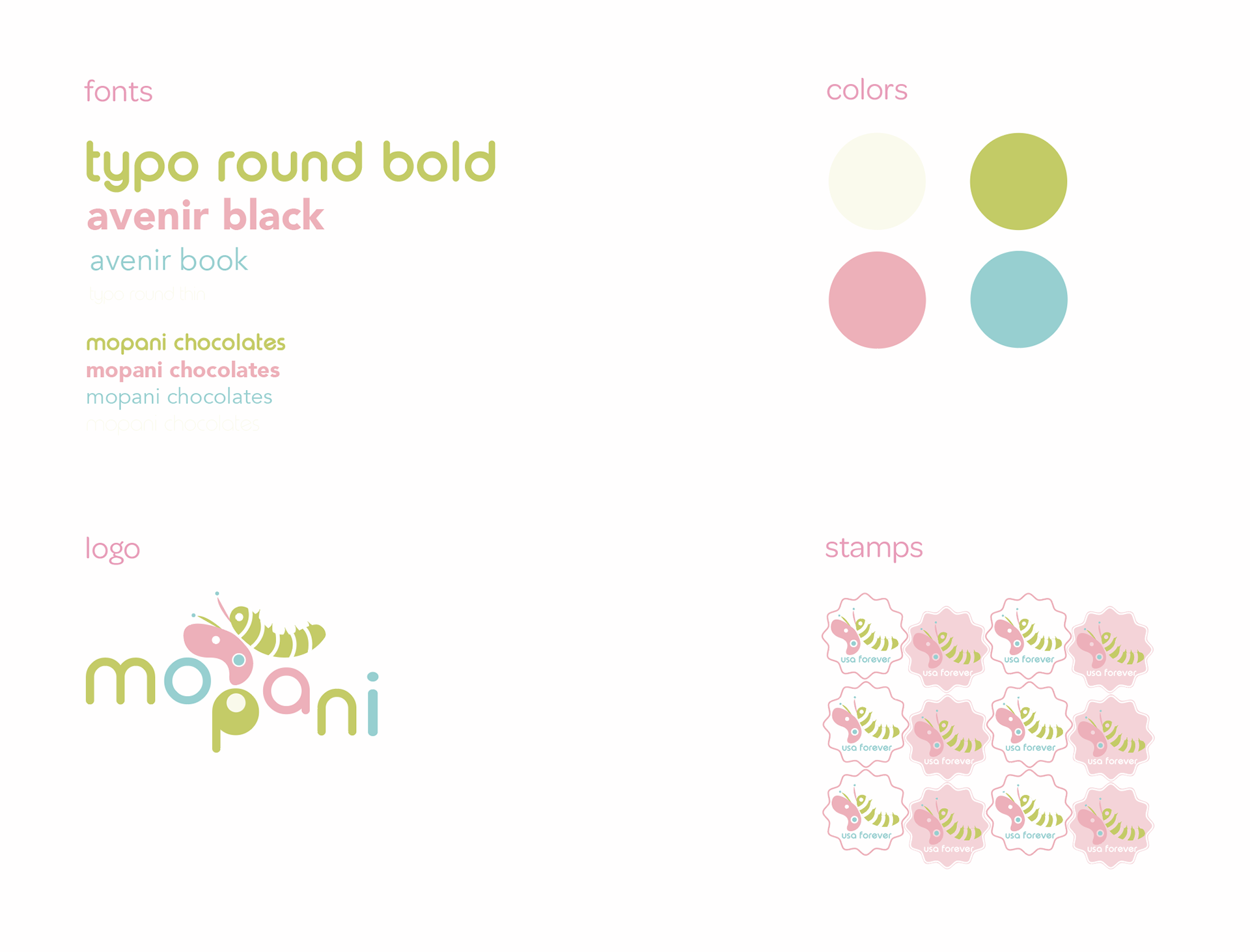
To create a playful and approachable aesthetic, I selected the rounded font "Typo Round Bold," evoking the friendly and fun vibe often associated with children's toys and products. For the body text, I used "Avenir Book" for its clean, geometric style, ensuring readability and a modern look. The packaging design features two shades of green as the primary colors, creating a vibrant and energetic feel while maintaining a gender-neutral appeal. This thoughtful approach ensures the product is visually engaging and inclusive for all kids.
Style
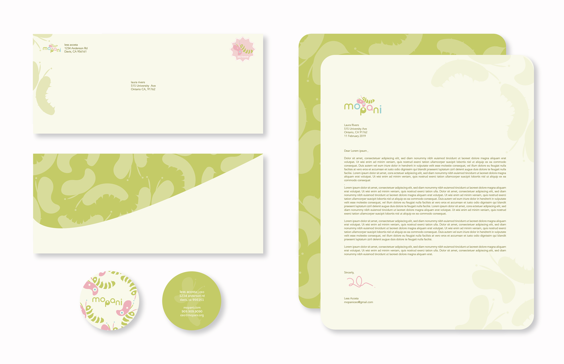
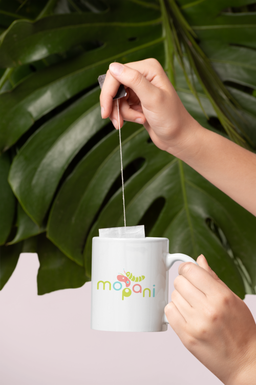
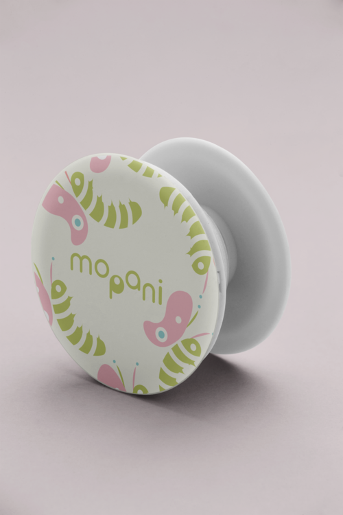
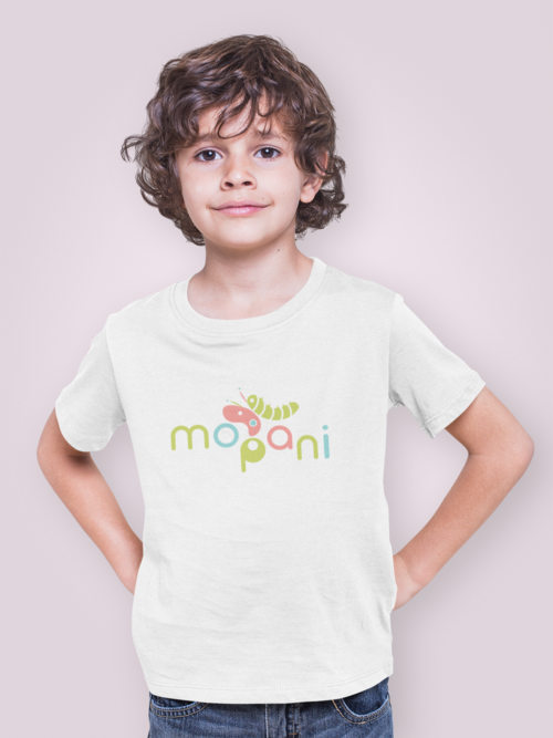
Stationary
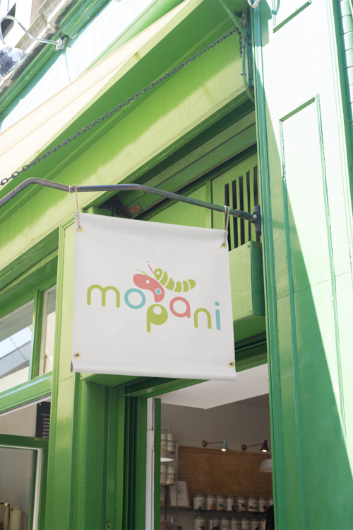
Deliverables
Packaging


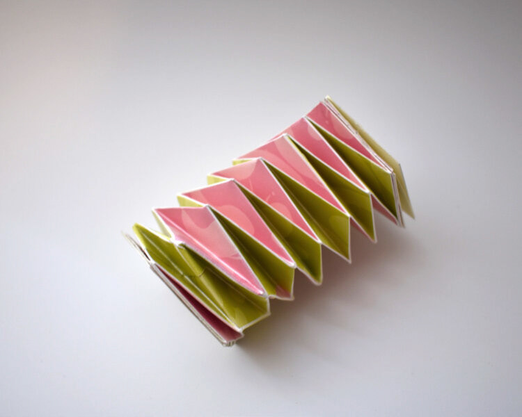
The packaging for Mopani was inspired by the growth motif central to the brand. I designed an accordion-style package made from sustainable paper, which can be compressed and elongated—mirroring the movement of a mopane worm as it stretches and contracts. This playful design encourages interaction, inviting kids to engage with the packaging even after finishing the snack. By choosing an eco-friendly material, I aimed to create a package that not only delights children but also reinforces the importance of sustainability, encouraging them to recycle it once it has served its purpose.